September 6th, 2015
If you have some background in journalism or mass-media communication you probably heard about the popular rule of the 5 wh-questions: any news story should provide an answer to the questions “who?”, “what?”, “why?”, “when?” and “where?”. But you may not know that such rule was taken from Cicero’s De Inventione, a kind of handbook for orators containing lots of hints on how to do a public speech in the 1st Century BC.
In particular, Cicero wrote that any good speech should contain a set of 6 properties used to determine the completeness of the exposition (expositio). These properties, or loci, and their relative questions, represent a classical principle of rhetoric that can be very useful for evaluating a website in all its aspects, too. It may be surprising, but any website in 2015 can be not so distant – as a communication process – from a speech in the ancient Roman Senate.
- QVIS (Who?) » IDENTITY
- QVID (What?) » CONTENT
- CVR (Why?) » SERVICES
- VBI (Where?) » LOCATION
- QVANDO (When?) » MANAGEMENT
- QVOMODO (How?) » USABILITY
This is the so-called 2QCV2Q Model, from the initial letters of the Ciceronian loci on which it is based, originally developed by L. Mich and M. Franch at University of Trento (Italy). It’s based on the fact that the design of a website, too, can be viewed as a series of answers to the question contained in Cicero’s rule. In fact, the original model identifies a set of evaluation elements for each of the 6 properties and the resulting checklist has 4 important features:
- it is general, so that it can be applied to any kind of website (corporate, ecommerce, individual portfolios, blogs, etc.)
- it is domain independent, meaning that it can be easily applied, for example, to the tourist sector as to non-profit organisations, to the automobile sector as to the public administration.
- it is easy to use, in fact it does not require highly specialised expertise, neither from a technical nor from a marketing/creative standpoint.
- it is robust, meaning that it contains all the basic elements needed to guarantee the quality of a website.
The following presentation sums up the whole methodology. Note that I updated the evaluation elements in order to include some modern principles of web design and UX that were not present when the original model was created.
Share:
Facebook,
Twitter,
LinkedIn
· Tags: project management, slideshare, ux, web design
February 1st, 2015
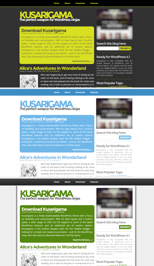
A long time ago (it was 2011) I created Kusarigama, a free and highly customizable theme for WordPress with a “classic” blog design, focused on readability, typography and ease-of-use.
With its clean layout and 3 built-in styles, 2 widget-enabled areas (sidebar and footer), its full support to some of the most useful WordPress features (such as custom menus and threaded comments) and an additional set of custom options (e.g., Google Analytics and easy banner inclusion), Kusarigama is perfect both for the newbie blogger – looking for a simple and ready-to-use theme – and for the WordPress ninja, who will enjoy its advanced features in all their glory.

Anyway, after all those years, it needed a graphic refresh and a code revision. Finally I’ve found some time to update it with a series of improvements listed here:
- Improved typography with Google Fonts integration
- Added a new font-type combination with mixed serif/sans-serif
- Kusarigama has now a HTML5 doctype
- Support for Google Universal Analytics code snippet
- Everything has been tested on WordPress 4.1
- Bugfixing and minor code imprvements
Preview Download
Kusarigama is available for free download as my personal gift to the amazing WordPress community. You can find a complete code history on GitHub.
Share:
Facebook,
Twitter,
LinkedIn
· Tags: freebies, web design, wordpress
January 6th, 2015
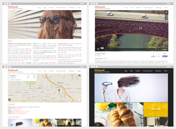
During this holiday season I found some time to release Wakizashi, my new WordPress theme designed with filmmakers and video producers in mind.

Wakizashi is a clean, simple and powerful video portfolio with the following features:
- Built-in Vimeo embedding
- Beautiful home page thumbnail grid
- 4 different stylesheets to choose from!
- 2 different templates for Pages (3-columns and 1-column)
- Contacts template with full-width Google Maps embed
- Good out-of-the-box SEO tagging and og:graph support
- Google Analytics integration and other easy-to-use custom options
» Read more about Wakizashi and take a complete look to its features.

Adding an item to your video portfolio will be as easy as creating a WordPress post: add title and description, upload a thumbnail image of your choice (yes, you won’t have to use random-selected still frames) and paste the Vimeo ID of your video. That’s all.
Preview Download
Wakizashi is released for free download under the GNU License. Wakizashi’s source code is also available on GitHub.
Share:
Facebook,
Twitter,
LinkedIn
· Tags: freebies, web design, wordpress


