December 21st, 2014
Seller ratings are a Google extension that helps people know how online stores are rated for their quality of service. This is a very important piece of information when users are making purchasing decisions: for example, an e-commerce website with good ratings generally has more qualified leads and better ad performance.
An important note: these reviews and ratings are not related to particular products (they are not product reviews), but reflect the overall consumer experience within the website. For example general product quality, customer care, shipping times and shipping costs are important parameters here.
How Seller Ratings Are Displayed
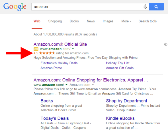
Seller ratings are showed next to AdWords ads on Google’s SERPs and can appear on both desktop and mobile devices.

Note that Google does not edit existing reviews but can filter out reviews that are considered untrustworthy or questionable.
Where Seller Ratings Come From
Here’s a list of valid seller ratings sources according to Google (I don’t know anything about their priority order, so assume they have the same importance):
- Google Certified Shops: a free certification programme currently enabled for US, UK, France, Japan, Germany and Australia.
- Ratings from Google Consumer Surveys: Google uses this platform to collect ratings at least once a year for certain domains and businesses.
- The following 3rd-party platforms and services:
Seller Ratings Requirements
Only ads that meet the following criteria are eligible to appear with seller ratings on Google search results and Google search partners:
- The campaign type should be set to “Search Network with Display Select”, “Search & Display Networks” or “Search Network only”.
- The business must have at least 30 unique reviews in the past 12 months and at least an average rating of 3.5 stars.
- At least 10 of the above reviews must be in the customer’s language.
Note that this extension is currently active only on Google.com, Google.co.uk, Google.co.nz, Google.com.au, Google.de, Google.co.jp, Google.fr and Google.nl.
You don’t need a Google Merchant Center account for your ads to be eligible for seller ratings and there are not additional costs if you wanto to add seller ratings to your campaign (you’ll be charged as usual for clicks on your ad).
How to get good ratings
This is a very easy question: the main way to improve your ratings is being a great business:
- make sure that your clients receive excellent customer service
- always read the reviews about your website
- try to resolve issues raised by your customer
And constantly check 3rd-party services working with/for you (e.g.shipping carrier): even if they’re not under your direct control, they can have an impact on your overall rating if they’re not doing their job well.
Share:
Facebook,
Twitter,
LinkedIn
· Tags: adwords, digital marketing, e-commerce, google
November 30th, 2014
The search box is one of the most popular topics in web design: you can find tons of posts and articles discussing on how the perfect search form has to be designed. That’s beacause anyone working in the digital field knows the importance of search in the general user experience of any website, especially for e-commerce and other premium services where a poor search experience can cost money.
In this post I’ll try to write down some quick notes on search box UX state of the art in A.D. 2014, with a focus on 9 aspects that in my opinion can make the difference in any situation. I’ll start with the basics, then I’ll add some points with most advanced features and new best practices.
1. Choose The Right Position
I can bother you with long articles and researches on this specific issue… But I won’t. Just take a look to the chart below, taken from a study by A. Dawn Shaikh and Keisi Lenz: it shows the expected position of the site search form in a survey with 142 participants.

So place that search box in the upper right area of your layout and you’ll be sure that your users will find it where they expect it to be.
2. Put The Search Button To The Right Of Its Input
This is quite a simple rule: you don’t have to be too creative when designing a search box. Users are accustomed to UX conventions like this one and, when those conventions are adhered to, they can understand quickly your website interface and operate more easily on it. For this reason, an example like the first one below is wrong.

Bonus Tip: the left example is wrong also for the button label “Go!”. A button named “Search” (or with an equivalent icon) identifies more clearly and more immediately the scope of the form.
3. Do Not Add Unnecessary Stuff
Basically, a search form should only consist of a text input and a button next to it. You won’t need anything else. In particular, displaying preset phrases inside the search field (for example “Type your search here”) is something really useless: anyone knows how to use a well designed search form and you should not create over-complication to it. See the example below, taken from Nielsen Norman Group’s website.

4. Make Room Enough For 27-Characters Queries
On its 2006’s study “Prioritizing Web Usability“, usability-guru Jakob Nielsen analyzed the length of search queries and discovered that most of search boxes are too short: of course you can type long queries, but only a portion of the text will be visible at a time and this means bad usability, since users cannot review and edit easily what they are writing.
Nielsen discovered that the average search box is 18-characters long and the 27% of queries were too long to fit into it. The best option is to have a 27-characters text input: it would accomodate 90% of queries.

5. Put The Search Box On Every Page
This is very simple and straighforward: you should always provide access to the search box because if your users cannot find the content that they are looking for, they will try to use your search regardless of where they are in your website.
6. Don’t Forget An “Autocomplete” Feature
It’s very important to provide an asynchronous autocomplete (or autosuggest) feature that helps user to quickly select relevant queries while he’s still typing. In terms of UI, you can see one of my favorites on Apple.com:

Some notes on why Apple’s search autosuggest is well done:
- It provides both popular searches and recommended results. Popular searches offer an important help to the user (see next point).
- Clicking on a recommended result brings directly to the detail page for that specific item, bypassing the search results page.
- The thumbnail images are lovely and help improving general UX with a more immediate recognition of recommended items. This is crucial for e-commerce.
- It’s fast. You can see the suggestions appearing basically in real-time as you type. This is maybe the most important aspect to take into consideration when developing a search autocomplete and, if missing, it can nullify all the good things you made on the three previous bullets.
7. Display The Most Popular Queries
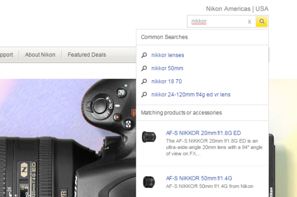
Displaying the most popular queries can be a great help to the user. This can be done inside the autosuggest dropdown menu, like in the previous example from Apple.com or the following from NikonUSA.com:

Note that the list of common searches should only contain valid queries, filtering anything non relevant (duplicate queries, mispelled queries, no-result queries).
Another way for displaying popular search is to show them as a default suggestion when users access the search form, like EstéeLauder.com does:

This is much more focused on marketing than on UX, but can be a quick and simple solution for going live with this feature without too much technical effort: having a human being that periodically checks internal search stats (for example on Google Analytics) and creates a list of the top 5 queries will be enough.
8. Be Prominent On Mobile
We are in 2014 and you should always put great attention on how your website behave on mobile devices. Regarding the search box, it doesn’t matter if you have a mobile-specific website or a responsive layout: what’s important is to keep search prominent in the design.
Look at the following examples from Gucci‘s, Nike‘s and Estée Lauder‘s mobile sites: search is always well visible on top of the layout.

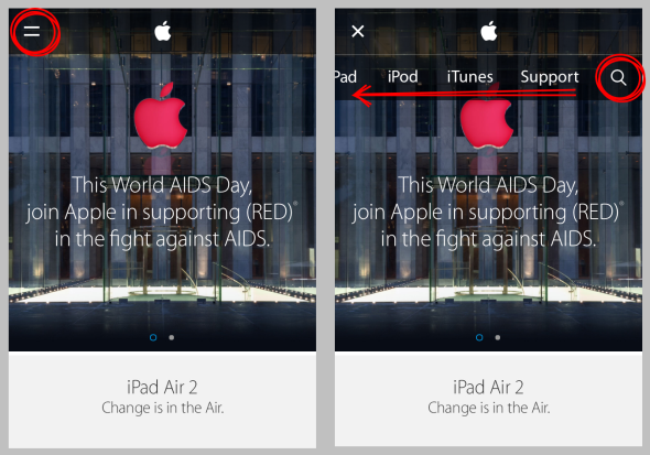
Apple’s mobile website does wrong in this case (actually they are anything but a best practice in terms of responsive design): you have to access the menu clicking on the top-left corner, then swipe horizontally the menu items in order to see the search icon on the right.

9. Make Search An Immersive Experience
This is quite a new trend and I love it. With a touch of HTML5, CSS3 and JS is now quite easy to create amazing transitions when the search input is on focus, making it really big and creating a full-screen immersive search experience. One of the best examples on this point is again EstéeLauder.com:

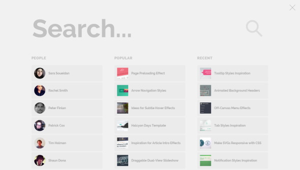
But my favorite template if you are starting from scrath is Morphing Search (from Codrops): with a smooth transition, it turns a standard search input into this beautifully-designed full-screen rich interface with suggestions and filters:

Note that this is only a frontend experiment, but it’s a very good template if you are looking for an inspiration on how to create a rich, usable and visually beautiful interface for internal search on your next project.
Share:
Facebook,
Twitter,
LinkedIn
· Tags: search box, tips, ux, web design
November 8th, 2014
As the traffic from smartphone and tablets rises every day, responsive design is becoming a very popular trend also in email marketing after having revolutioned the way we code websites.
Creating a fluid, responsive email template is made more complex by the abundance of client software and devices in the market, making it quite difficult to be sure that your design stays consistent on every possible screen, resolution and OS.

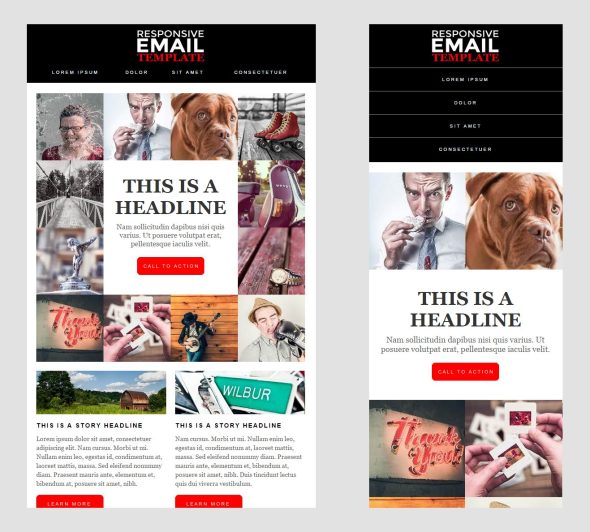
With the help of a very useful resource like Responsive Email Patterns, I created my own responsive email template focused on the following features:
- full width header with responsive navigation menu
- 3 easily combinable content modules
- clean footer with social icons and legal links
As you can see, it’s a very simple and versitile template that can be easily adapted for business or editorial purpose.
Preview Download
CURRENT VERSION: v1.1.1, released on November 8, 2015.
UPDATE: Original source code also available on GitHub.
Share:
Facebook,
Twitter,
LinkedIn
· Tags: email marketing, freebies, mobile, responsive design
