ASO (App Store Optimization): A Quick Start Guide To Boost Your App’s Ranking
August 7th, 2015
If you are involved in any web-related activity, from development to digital marketing, you are probably aware of the critical importance of SEO (Search Engine Optimization) for the success of any web project: a good ranking on Google for a set of relevant keywords can boost your traffic enormously.
Something similar happens for iOS and Android apps on Apple App Store and Google Play resepctively: ASO (App Store Optimization) is the equivalent of SEO in the world of mobile apps and, like SEO, it can be crucial for the success of an app. In fact, the higher an app ranks in the app store’s search results, the more visible it is to your potential users. And more visibility means of course more downloads: this is very easy to understand if you think that more than 60% of app downloads comes from users searching for something on app stores!
Anyway, ASO is in some ways more complex than SEO because it involves not only “technical” issues like choosing the right keywords for your app and writing a strategic copy, but it also requires some marketing-related actions like – for example – creating beautiful screenshots showing the main features of your app in order to encourage users to tap that “Install” button.
This post will give you a checklist of the most important ASO assets, with some advices on how to put together everything you need for publishing your app on Apple App Store and/or Google Play.
Apple App Store
- TITLE. The first important thing you need to know is that the title of your app on the app store can be different from the display name you see on your iPhone’s home screen. For this reason you don’t need to keep it very short. In fact, the Title field accept up to 255 characters and it’s very important for the search algorithm. But be careful not to exceed with keywords here, otherwise your app submission can be rejected due to keywords stuffing.
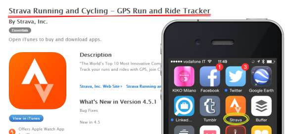
Title vs. Display Name: Strava does it well.
- DESCRIPTION. The basic rule is to write a clear and well formatted text of no more than 4000 characters. A good idea is to use bullet lists to point out the most important features of your app. An important thing to remember is that only the first 3 lines of the description are visibile by default in the app’s page, so be sure to use it for giving a short and powerful overview of what users can do with it.
- KEYWORDS. This is the most complex and critical item of the whole checklist. Keywords are very important for the Apple App Store’s search algorithm, so you have to choose them with great accuracy and a “scientific approach”. Be sure to follow the basic rules:
- keep the keyword list within a maximum of 100 characters
- try to use all of the allowed characters
- use only commas to separate keywords
- do not waste characters adding a space after each comma
- exclude any word you already used in the title
- yes, this means that you won’t have your app’s name here
- do not repeat the same keyword twice
- do not use the same keyword in singular and plural form
- analyze which keywords are used by your competitors
- use Google AdWords Planner to help you in choosing the best keywords for your app
- use a tool like Sensor Tower to fine tune your keywords in terms of competition and traffic
Google Play
- TITLE. You have 30 characters available for the title on Google Play. If possible, try to use a keyword here.
- DESCRIPTION. Basically you should follow the same rules listed for Apple. Keep in mind that Google Play identifies the keywords from this field, so it’s important to use them in your copy and it’s good to repeat them (no more than 3 or 4 times). Again, do not exceed with keyword stuffing.
Graphic Assets
- ICON. You should use your logo if it’s well known by your potential users (think about the apps published by big companies like Nike or Twitter). Otherwise you should create a descriptive icon showing a feature of your app, a character from your game, etc.: this can be very tricky and will probably require the help of a professional graphic designer or illustrator with an expertise in creating icons.
Descriptive app icons vs. logos.
- SCREENSHOTS. They are super-important. You can follow these rules to create powerful screenshots for your mobile app:
- add an image to each the available slots
- choose carefully the order of the screenshots
- of course your best screenshot must be the first one
- every screenshot should portray a key feature of the app
- it’s good to add a companion copy to the screenshots
- it’s a good idea to zoom or highlight some elements
- keep everything clean, bright and immediate
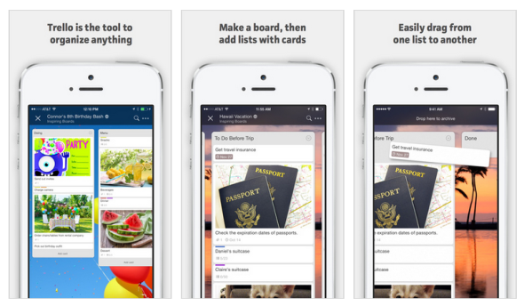
Trello’s screenshots with embedded copy.
- VIDEO. You can also add a 30-seconds video preview of your app on the Apple App Store. Note that if you post a video preview, it will be used as the first screenshot, so only do it if you can create a professional, high quality content.
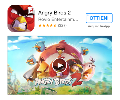
An app listed with its video preview.
Final Tips
- RELEASE NOTES (“WHAT’S NEW”). A lot of app publishers do not take care of release notes when a new version of the app is submitted. This is a huge mistake: this field will be probably filled-in by the mobile developer in charge of submitting the app. I love developers, but usually they’re not great copywriters and they often hate any data-entry task. This is why you can find a lot of release notes just saying things like “Minor bugfixing.”… Not so catchy, don’t you think?
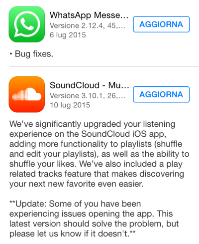
Comparison between different kinds of release notes.
- LOCALISATION. If you are distributing your app across different countries it’s best practice to localise everything, from copy to screenshots. Note that you cannot localise the video, at the moment.
- RATINGS. Keep in mind that app with an higher rating are better ranked both on Google Play and Apple App Store.
- DOWNLOADS. The same happens with app downloads: the more they are, the more visible will be the app in every listing.
